Summaries of individual variables provide an important "first look" at your data. Some of the tasks that these summaries help you to complete are listed below.
• Determining "typical" values of the variables. What values occur most often? What range of values are you likely to see?
• Checking the assumptions for statistical procedures. Do you have enough observations? For each variable, is the observed distribution of values adequate?
• Checking the quality of the data. Are there missing or mis-entered values? Are there values that should be recoded?
The Frequencies procedure is useful for obtaining summaries of individual variables. The following examples show how Frequencies can be used to analyze variables measured at nominal, ordinal, and scale levels.
Using Frequencies to Study Nominal Data
==============================
You manage a team that sells computer hardware to software development companies. At each company, your representatives have a primary contact. You have categorized these contacts by the department of the company in which they work (Development, Computer Services, Finance, Other, Don't Know).
1) Running the Analysis
This information is collected in contacts.sav.
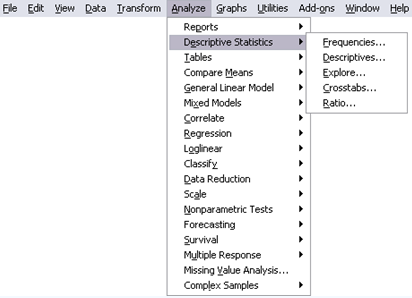
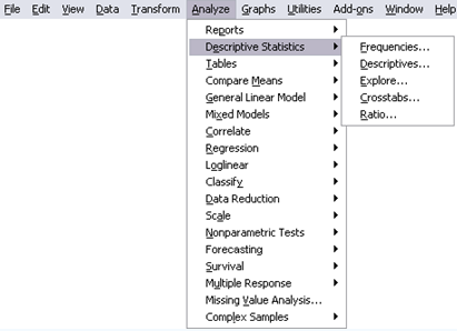
► To run a Frequencies analysis, from the menus choose:
Analyze > Descriptive Statistics > Frequencies...
► Select Department as an analysis variable.
► Click Charts.

► Select Pie charts.
► Click Continue.
► Click OK in the Frequencies dialog box.

These selections generate the following command syntax:
FREQUENCIES
VARIABLES=dept
/PIECHART
/ORDER= ANALYSIS .
• The procedure produces a frequency table and pie chart for the variable dept.
2) Pie Chart
A pie chart is a good visual tool for assessing the relative frequencies of each category.
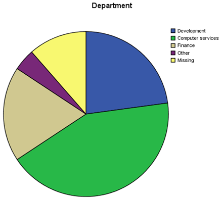
At a glance, you see that the plurality of your contacts work in the computer services departments of their respective companies, followed by those in the financial and development departments.
3) Frequency Table
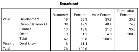
The frequency table shows the precise frequencies for each category.
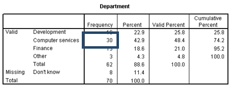
The Frequency column reports that 30 of your contacts come from the computer services department.
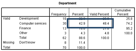
This is equivalent to 42.9% of the total number of contacts and 48.4% of the contacts whose departments are known.
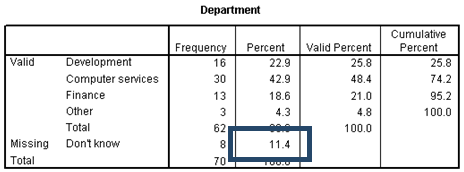
You can also see that the departmental information is missing for 11.4% of your contacts.
4) Bar Chart
A bar chart, ordered by descending frequencies, quickly helps you to find the mode and also to visually compare the relative frequencies.
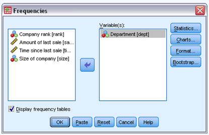
► To obtain an ordered bar chart, recall the Frequencies dialog box.
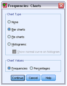
► Click Charts.
► Select Bar charts.
► Click Continue.
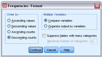
► Click Format in the Frequencies dialog box.
► Select Descending counts.
► Click Continue.
► Click OK in the Frequencies dialog box.
These selections generate the following command syntax:
FREQUENCIES
VARIABLES=dept
/FORMAT=DFREQ
/BARCHART
/ORDER= ANALYSIS .
• The procedure produces a bar chart with the categories ordered by descending frequency.
Again, you see that the plurality of contacts come from computer services departments.

Using Frequencies to Study Ordinal Data
=============================
In addition to the department of each contact, you have recorded their company ranks. Use Frequencies to study the distribution of company ranks to see if it meshes with your goals.
1) Running the Analysis
► To summarize the company ranks of your contacts, from the menus choose:
Analyze > Descriptive Statistics > Frequencies...
► Click Reset to restore the default settings.
► Select Company Rank as an analysis variable.
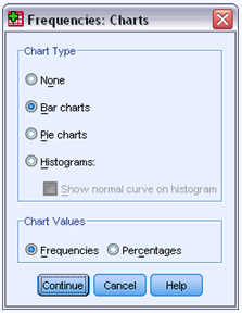
► Click Charts.

► Select Bar charts.
► Click Continue.
► Click Format in the Frequencies dialog box.
► Select Descending values.
► Click Continue.
► Click OK in the Frequencies dialog box.

These selections generate the following command syntax:
FREQUENCIES
VARIABLES= rank
/FORMAT=DVALUE
/BARCHART
/ORDER= ANALYSIS .
• The procedure produces a frequency table and bar chart with the categories ordered by descending value.
2) Frequency table
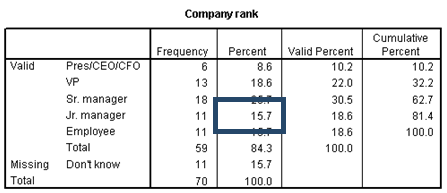
The frequency table for ordinal data serves much the same purpose as the table for nominal data. For example, you can see from the table that 15.7% of your contacts are junior managers.
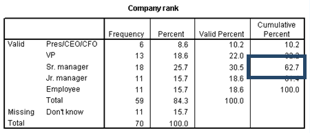
However, when studying ordinal data, the Cumulative Percent is much more useful. The table, since it has been ordered by descending values, shows that 62.7% of your contacts are of at least senior manager rank.
3) Bar chart
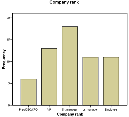
As long as the ordering of values remains intact, reversed or not, the pattern in the bar chart contains information about the distribution of company ranks. The frequency of contacts increases from Employee to Sr. Manager, then decreases somewhat at VP, then drops off.
Using Frequencies to Study Scale Data
===========================
For each account, you've also kept track of the amount of the last sale, in thousands. You can use Frequencies to study the distribution of purchases.
1) Running the Analysis
► To summarize the amounts of the last sales, from the menus choose:
Analyze > Descriptive Statistics > Frequencies...
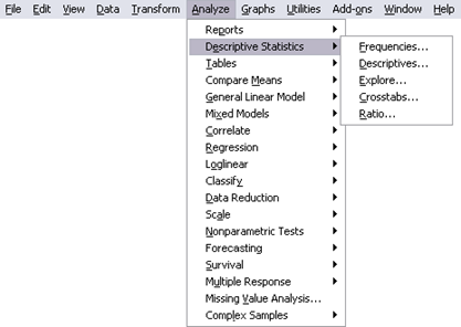
► Click Reset to restore the default settings.
► Select Amount of Last Sale as an analysis variable.
► Deselect Display frequency tables.
► Click OK in the warning dialog box.
It is a good idea to turn off the display of frequency tables for scale data because scale variables usually have many different values.
► Click Statistics in the Frequencies dialog box.
► Check Quartiles, Std. deviation, Minimum, Maximum, Mean, Median, Skewness, and Kurtosis.
► Click Continue.
► Click Charts in the Frequencies dialog box.
► Select Histograms.
► Select With normal curve.
► Click Continue.
► Click OK in the Frequencies dialog box.
These selections generate the following command syntax:
FREQUENCIES
VARIABLES=sale
/FORMAT=NOTABLE
/NTILES= 4
/HISTOGRAM= NORMAL
/STATISTICS=STDDEV MINIMUM MAXIMUM MEAN MEDIAN
SKEWNESS KURTOSIS
/ORDER= ANALYSIS .
• The procedure produces a table of statistical summaries and a histogram for Amount of Last Sale.
• FORMAT suppresses the Frequency tables, which are not useful for continuous variables.
2) Statistics table
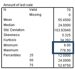
The statistics table tells you several interesting things about the distribution of sale, starting with the five-number summary.
The center of the distribution can be approximated by the median (or second quartile) 20.25, and half of the data values fall between 12.0 and 52.875, the first and third quartiles.

Also, the most extreme values are 6.0 and 776.5, the minimum and maximum.
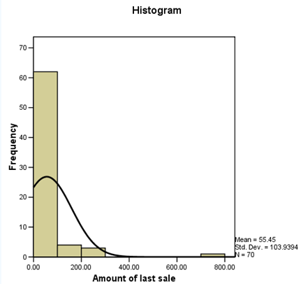
The mean is quite different from the median, suggesting that the distribution is asymmetric.
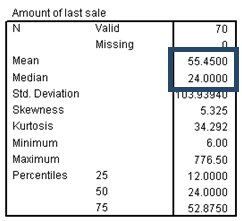
This suspicion is confirmed by the large positive skewness, which shows that sale has a long right tail. That is, the distribution is asymmetric, with some distant values in a positive direction from the center of the distribution. Most variables with a finite lower limit (for example, 0) but no fixed upper limit tend to be positively skewed.
The large positive skewness, in addition to skewing the mean to the right of the median, inflates the standard deviation to a point where it is no longer useful as a measure of the spread of data values.
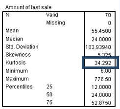
The large positive kurtosis tells you that the distribution of sale is more peaked and has heavier tails than the normal distribution.
3) Histogram
The histogram is a visual summary of the distribution of values. The overlay of the normal curve helps you to assess the skewness and kurtosis.
Summarizing transformed data
======================
Many statistical procedures for quantitative data are less reliable when the distribution of data values is markedly non-normal, as is the case with Amount of Last Sale. Sometimes, a transformation of the variable can bring the distribution of values closer to normal.
1) Transforming the Data
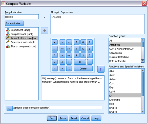
► To transform the variable sale, from the menus choose:
Transform > Compute Variable...

► Type logsale as the Target Variable.
► Type LN(sale) as the Numeric Expression.
► Click OK.
The log transformation is a sensible choice because Amount of Last Sale takes only positive values and is right skewed.
► Recall the Frequencies dialog box.
► Deselect sale as an analysis variable.
► Select logsale as an analysis variable.
► Click OK.

These selections generate the following command syntax:
COMPUTE logsale = ln(sale).
EXECUTE.
FREQUENCIES
VARIABLES=logsale
/FORMAT=NOTABLE
/NTILES= 4
/HISTOGRAM=NORMAL
/STATISTICS=STDDEV MINIMUM MAXIMUM MEAN MEDIAN
SKEWNESS KURTOSIS
/ORDER= ANALYSIS .
2) Statistics table
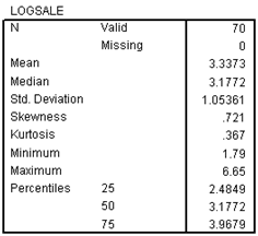
From the statistics table, it appears that the transformation has brought the distribution closer to normal. The skewness and kurtosis are greatly reduced, and the mean and median are much closer together.
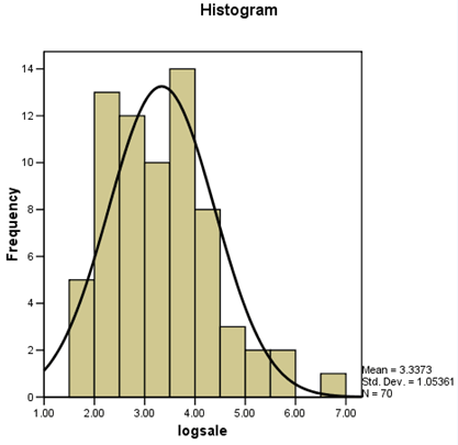
The histogram is also much closer to the normal curve.
Summary
=======
You have assessed the distributions of the departments and company ranks of your contacts and the amounts of last sales. After seeing that the distribution of sales is highly skewed, you found that the log-transformed sales are more viable for further analysis.
Related Procedures
==============
• The Descriptives procedure focuses specifically on scale variables and provides the ability to save standardized values (z scores) of your variables.
• The Crosstabs procedure allows you to obtain summaries for the relationship between two categorical variables.
• The Means procedure provides descriptive statistics and an ANOVA table for studying relationships between scale and categorical variables.
• The Summarize procedure provides descriptive statistics and case summaries for studying relationships between scale and categorical variables.
• The OLAP Cubes procedure provides descriptive statistics for studying relationships between scale and categorical variables.
• The Correlations procedure provides summaries describing the relationship between two scale variables.
Recommended Readings
==================
See the following texts for more information on summarizing data:
Hays, W. L. 1981. Statistics, 3rd ed. New York: Holt, Rinehart, and Winston.
Norusis, M. 2004. SPSS 13.0 Guide to Data Analysis. Upper Saddle-River, N.J.: Prentice Hall, Inc..
Norusis, M. 2004. SPSS 13.0 Statistical Procedures Companion. Upper Saddle-River, N.J.: Prentice Hall, Inc..