1) To edit the chart, open it in the Chart Editor.
1a) Double-click the bar chart to open it in the Chart Editor.

2) To edit a chart element, you first select it.
2a) Click any one of the bars. The rectangles around the bars indicate that they are selected.

3) To select an individual element in a group, "drill down" by clicking the element while the group is selected.
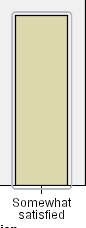
3a) Click the bar for Highly satisfied respondents. Only that bar remains selected.

If you want to select a different bar, you can just click it.
3b) Click the bar for Somewhat satisfied respondents. Now that is the only bar selected
.
To select multiple elements, click each element while pressing the Ctrl key.
3c) With the Somewhat satisfied bar selected, press the Ctrl key and click the Highly satisfied bar. Both bars are now selected.

4) This example demonstrates a general "drill-down" rule of simple charts:
When no graphic elements are selected, click any graphic element to select all graphic elements.
When all graphic elements are selected, click a graphic element to select only that graphic element. You can select a different graphic element by clicking it. To select multiple graphic elements, click each element while pressing the Ctrl key.
Note: The behavior is slightly different for grouped charts. Grouped charts are discussed in the scatterplot example.
4a) To deselect all elements, press the Esc key.
4b) Click any bar to select all of the bars again.
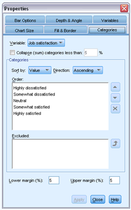
5) Using the properties window
5a) From the Chart Editor menus choose:
Edit > Properties

6) This opens the Properties window, showing the tabs that apply to the bars you selected. These tabs change depending on what chart element you select in the Chart Editor. For example, if you had selected a text frame instead of bars, different tabs would appear in the Properties window. You will use these tabs to do most chart editing.
7) First, you will change the color of the bars. You specify color attributes of graphic elements (excluding lines and markers) on the Fill & Border tab.
7a) Click the Fill & Border tab.
7b) Click the swatch next to Fill to indicate that you want to change the fill color of the bars. The numbers below the swatch specify the red, green, and blue settings for the current color.
7c) Click the light blue color, which is second from the left in the second row from the bottom.
7d) Click Apply.
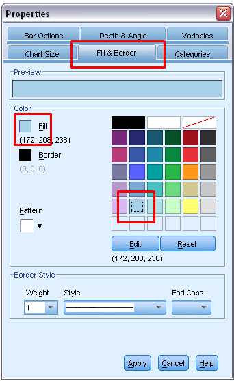
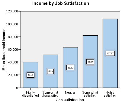
8) The bars in the chart are now light blue.
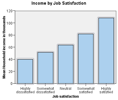
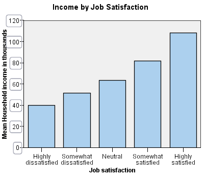
9) Notice that the numbers on the y axis are scaled in thousands. To make the chart more attractive and easier to interpret, we will change the number format in the tick labels and then edit the axis title appropriately.

9a) Select the y axis tick labels by clicking any one of them.
9b) To reopen the Properties window (if you closed it previously), from the menus choose:
Edit > Properties
Note: From here on, we assume that the Properties window is open. If you have closed the Properties window, follow the previous step to reopen it. You can also use the keyboard shortcut Ctrl+T to reopen the window.

10) Different tabs are available now that the tick labels are selected instead of the bars.
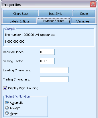
10a) Click the Number Format tab.
10b) You do not want the tick labels to display decimal places, so type 0 in the Decimal Places text box.
10c) Type 0.001 in the Scaling Factor text box. The scaling factor is the number by which the Chart Editor divides the displayed number. Because 0.001 is a fraction, dividing by it will increase the numbers in the tick labels by 1,000. Thus, the numbers will no longer be in thousands; they will be unscaled.
10d) Select Display Digit Grouping. Digit grouping uses a character (specified by your computer's locale) to mark each thousandth place in the number.
10e) Click Apply.
11) The tick labels reflect the new number formatting: There are no decimal places, the numbers are no longer scaled, and each thousandth place is specified with a character.

12) Now that you have changed the number format of the tick labels, the axis title is no longer accurate. Next, you will change the axis title to reflect the new number format. You do not need to open the Properties window to edit text. You can edit text directly on the chart.
12a) Click the y axis title to select it.
12b) Click the axis title again to start edit mode. While in edit mode, the Chart Editor positions any rotated text horizontally. It also displays a flashing red bar cursor (not shown in the example).
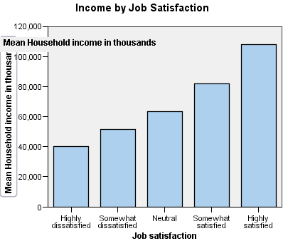
12c) Delete the following text:
in thousands
12d) Press Enter to exit edit mode and update the axis title. The axis title now accurately describes the contents of the tick labels.
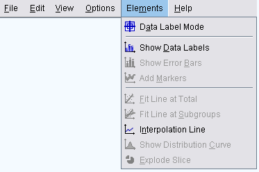
13) Displaying data value labels
Another common task is to show the exact values associated with the graphic elements (which are bars in this example). These values are displayed in data labels.
13a) From the Chart Editor menus choose:
Elements > Show Data Labels
14) Each bar in the chart now displays the exact mean household income. Notice that the units are in thousands, so you could use the Number Format tab again to change the scaling factor.
15 Using templates
If you make a number of routine changes to your charts, you can use a chart template to reduce the time needed to create and edit charts. A chart template saves the attributes of a specific chart. You can then apply the template when creating or editing a chart.
We will save the current chart as a template and then apply that template while creating a new chart.
15a) From the menus choose:
File > Save Chart Template...

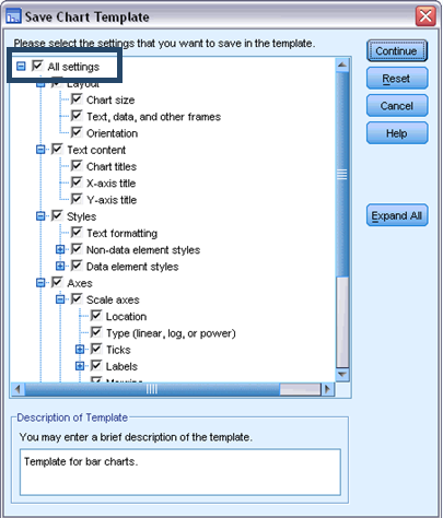
16) The Save Chart Template dialog box allows you to specify which chart attributes you want to include in the template.

17) If you expand any of the items in the tree view, you can see which specific attributes can be saved with the chart. For example, if you expand the Scale axes portion of the tree, you can see all of the attributes of data value labels that the template will include. You can select any attribute to include it in the template.
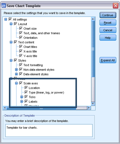
17a) Select All settings to include all of the available chart attributes in the template.
18) You can also enter a description of the template. This description will be visible when you apply the template.
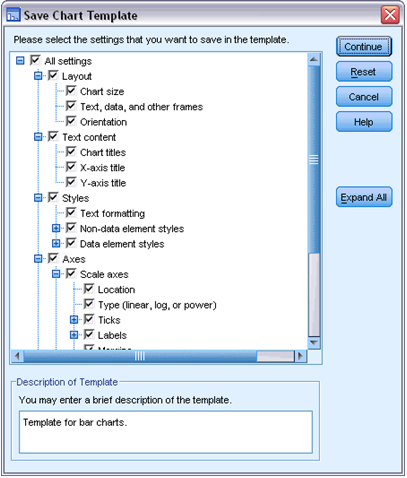
18a) Click Continue.
18b) In the Save Template dialog box, specify a location and filename for the template.
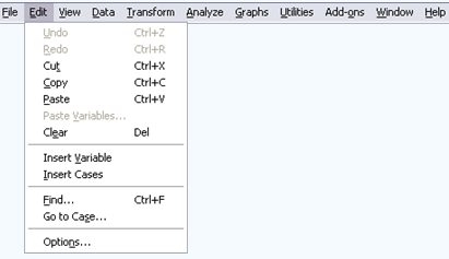
18c) When you are finished, click Save.18d) In addition to using templates to format charts, you can use the Options to control various aspects of how charts are created.18e) From the Data Editor or Viewer menus choose:Edit > Options...
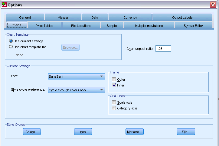
19) The Options dialog box contains many configuration settings. Click the Charts tab to see the available options.
No comments:
Post a Comment