You can create and edit a wide variety of chart types.
1) To demonstrate the basics of chart creation, we will create a bar chart of mean income for different levels of job satisfaction. This example uses the data file demo.sav.
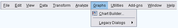
► From the menus choose:
Graphs > Chart Builder...
2) The Chart Builder dialog box is an interactive window that allows you to preview how a chart will look while you build it.
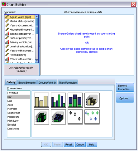
► Click the Gallery tab if it is not selected.

3) The Gallery includes many different predefined charts, which are organized by chart type. The Basic Elements tab also provides basic elements (such as axes and graphic elements) for creating charts from scratch, but it's easier to use the Gallery.
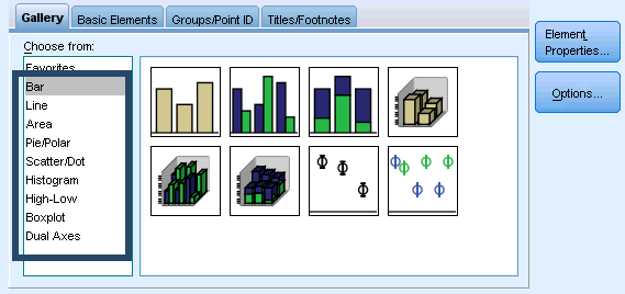
► Click Bar if it is not selected.
4) Icons representing the available bar charts in the Gallery appear in the dialog box. The pictures should provide enough information to identify the specific chart type.

5) If you need more information, you can also display a ToolTip description of the chart by pausing your cursor over an icon.

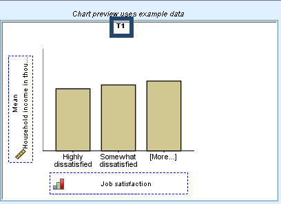
► Drag the icon for the simple bar chart onto the "canvas," which is the large area above the Gallery. The Chart Builder displays a preview of the chart on the canvas. Note that the data used to draw the chart are not your actual data. They are example data.
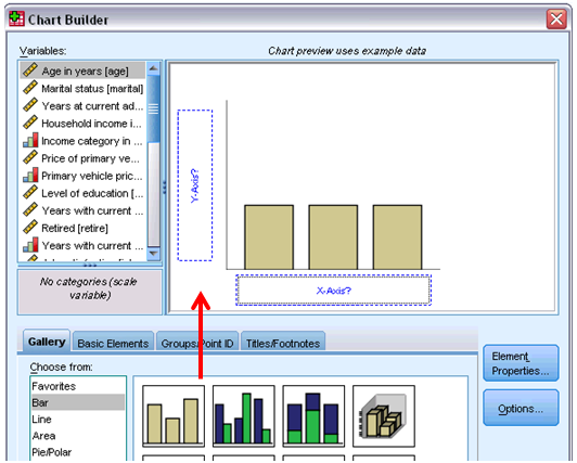
6) Although there is a chart on the canvas, it is not complete because there are no variables or statistics to control how tall the bars are and to specify which variable category corresponds to each bar. You can't have a chart without variables and statistics.
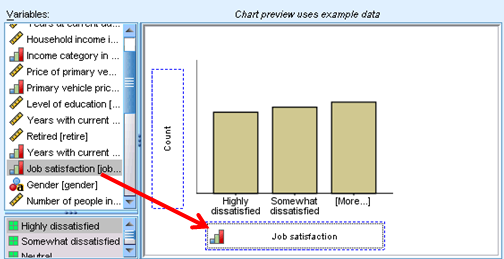
7) You add variables by dragging them from the Variables list, which is located to the left of the canvas.
8) When you drag the variables, the targets are "drop zones" on the canvas. Some drop zones require a variable while others do not.
9) The drop zone for the x axis is required. The variable in this drop zone controls where the bars appear on the x axis.

10) Depending on the type of chart you are creating, you may also need a variable in the y axis drop zone. For example, when you want to display a summary statistic of another variable (such as mean of salary), you need a variable in the y axis drop zone. Scatterplots also require a variable in the y axis. In that case, the drop zone identifies the dependent variable.

11) You are going to create a chart that shows bars for the mean income of each job satisfaction category, so both drop zones are needed. There will be a categorical variable on the x axis and a scale variable on the y axis for calculating the mean.
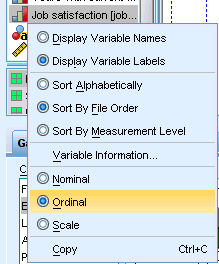
12) A variable's measurement level is important in the Chart Builder. You are going to use the Job satisfaction variable on the x axis. However, the icon (which looks like a ruler) next to the variable indicates that its measurement level is defined as scale. To create the correct chart, you must use a categorical measurement level. Instead of going back and changing the measurement level in the Variable View, you can change the measurement level temporarily in the Chart Builder.

► Right-click Job satisfaction in the Variables list and choose Ordinal. Ordinal is an appropriate measurement level because the categories in Job satisfaction can be ranked by level of satisfaction. Note that the icon changes after you change the measurement level.
► Now drag Job satisfaction from the Variables list to the x axis drop zone.
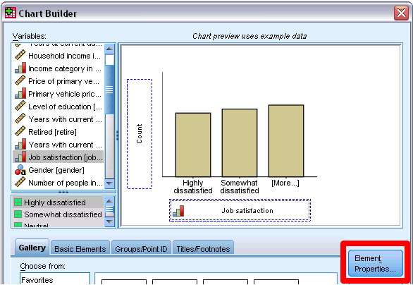
13) The y axis drop zone defaults to the Count statistic.
14) If you want to use another statistic (such as percentage or mean), you can easily change it. You will not use either of these statistics in this example, but we will review the process in case you need to change this statistic at another time.
► Click Element Properties to display the Element Properties window.
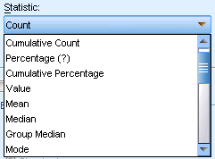
15) The Element Properties window allows you to change the properties of the various chart elements. These elements include the graphic elements (such as the bars in the bar chart) and the axes on the chart. Select one of the elements in the Edit Properties of list to change the properties associated with that element.

16) Also note the red X located to the right of the list. This button deletes a graphic element from the canvas.
17) Because Bar1 is selected, the properties shown apply to graphic elements, specifically the bar graphic element.
18) The Statistic drop-down list shows the specific statistics that are available. The same statistics are usually available for every chart type. Be aware that some statistics require that the y axis drop zone contains a variable.
19) Return to the Chart Builder dialog box and drag Household income in thousands from the Variables list to the y axis drop zone.

20) Because the variable on the y axis is scalar and the x axis variable is categorical (ordinal is a type of categorical measurement level), the y axis drop zone defaults to the Mean statistic. These are the variables and statistics you want, so there is no need to change the element properties.
21) You can also add titles and footnotes to the chart.
► Click the Titles/Footnotes tab.

► Select Title 1.

22)The title appears on the canvas with the label T1.
► In the Element Properties window, select Title 1 in the Edit Properties of list.
► In the Content text box, type Income by Job Satisfaction. This is the text that the title will display.
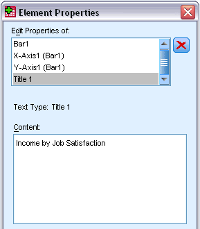
► Click Apply to save the text. Although the text is not displayed in the Chart Builder, it will appear when you generate the chart.
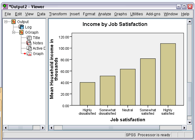
► Click OK to create the bar chart.
23) The bar chart reveals that respondents who are more satisfied with their jobs tend to have higher household incomes.
No comments:
Post a Comment